I completed the TextileArtist.org‘s Stitch Club workshop with Deborah Boschert making a mixed media art quilt. Boy and I had recently driven out of state one day to simply fend off some boredom, and we came across a nice little restaurant named Timothy’s. In honor of that spontaneous trip, I sat down with my supplies to create a piece using the mood of the restaurant’s interior design.
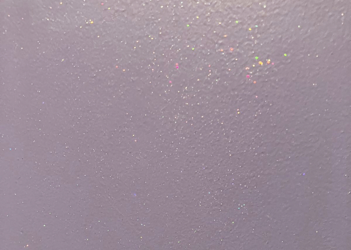
As you can see, this is outside of my usual color schema, and I always struggle there. But the restaurant had a fresh design using vivid colors like this in the upholstery, wallpaper, and glass decorations. The sparkly paint on one of the walls made me happy, and I had just watched the workshop that morning so I snapped a photo knowing it would become part of the project.
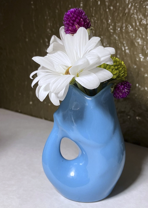
Each table had a small fish vase with a large white flower and pops of color, which is how I came to choose the focal motif. It is cut from a swatch of leather that I “embellished” with silver and black sharpies. I do wonder if I should have painted the leather bright blue, but at the time the grey seemed to be ok. (It is one of the features I like least, now.)
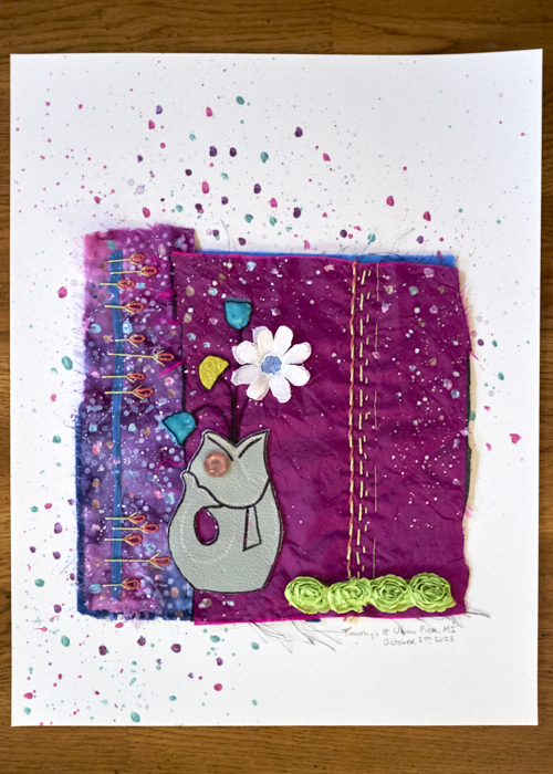
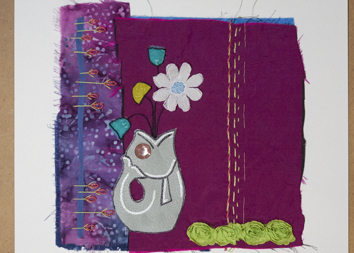
Deborah’s prompt was to attach our work to a piece of paper and carry the theme over and onto the surface with paint. I wasn’t sure if I wanted to add paint, though, since I hadn’t ever attempted that before. Here is the pre-painted version, that sat around until this weekend when I finally dug out the paints:
But the entire point of my being a Textile Artist Stitch Club member is to push boundaries, explore techniques, and just play with art – it isn’t about making things I love (though of course, that is ideal!). So, I saw the dots in the batik fabric on the left, and used that as the paint theme to carry over. I wanted to keep it fairly simple and vertical just on the left side, but as it happens, some paint got elsewhere. Rather than being upset, I rolled with it to blend it in, adding a swoop of paint back down to the right. I think it is too much paint (another feature I dislike), but the paint has such a lustrous gold pearlescent hue (not readily seen in photography) that it still fits with the theme, I think.
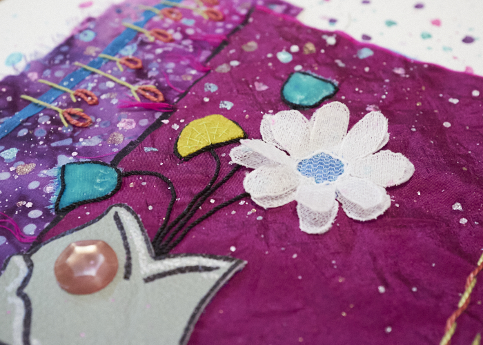
The white flower is a cut off of some lace that I doubled up to have a little 3D effect. The blue flowers are soft velvet, and the mustardy one is a wool felt. The fish eye is an antique button. Stems and floral outlines are in a tacked-down shiny black twine. There is green quilters cotton and pink and green Perle cotton running down the right side and combos of fly and lazy daisy stitching stacked sideways on the left.
The magenta fabric is a cut from a blouse I had long ago, overlaying the batik strip. These are tacked on dark blue fabric and a light blue felt, both barely peeking out. I had a blue blouse of the same material as the magenta; a thin strip of it is wedged under the stitching on the left. There is a strip of green floral trim I added to weigh the bottom down a bit. And that’s that. If I liked it more than I do, I would probably paint that fish. Alas, this one will retire to the storage bucket for now. I did like the workshop, however, so I want to revisit it again sometime. Thanks, Deborah!


0 Comments