TextileArtist.org‘s fifteenth workshop was hosted by Sabine Kaner who presented us such a clever idea to get an abstract design! I don’t believe I will ever pursue abstract art for myself, but some of the pieces Sabine and Stitch Club members made are quite beautiful. I was intrigued to give it a go, to at least learn the process. In fact, if the mood ever does strike to add an abstract element, I think this would be my go to approach since it doesn’t allow my thinking brain to get in the way of an abstract design, like it tends to do.
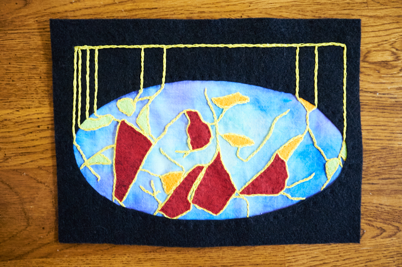
I began with a crumpled piece of paper and ended with a design that reminded me of illustrations of neurons in the brain. Because of that, I chose colors used commonly in brain scans: bright and bold red, orange, yellow, and green against a backdrop of deep blue, purple and black.
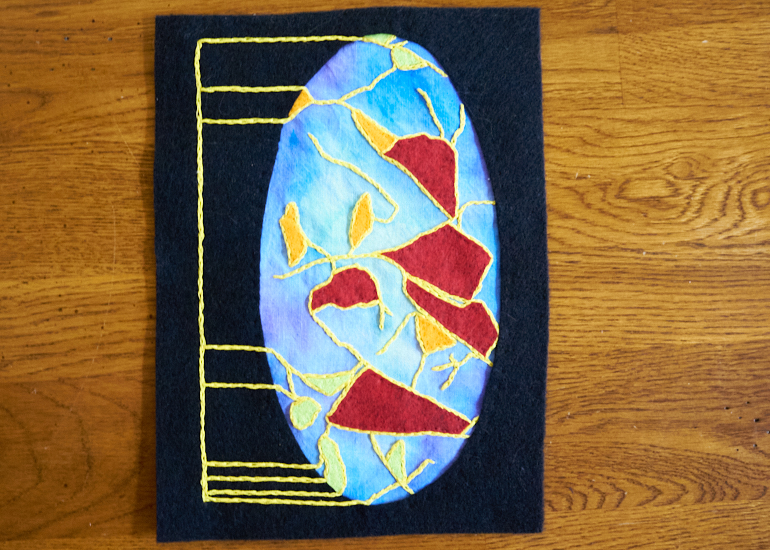
I chose an oblong oval for the main design, so after it all came together, it really does remind me of maps of the globe more than neurons. Oh well.
Knowing I would be framing it in black, I needed to color the fabric with blue and purple. I experimented with painting fabric in a different workshop by Wilkins, and didn’t enjoy using acrylic paints so much. Sabine used watercolor paint and I couldn’t find mine but I did find my old calligraphy inks. Painting fabric with them was a delight, actually! This is why I love Stitch Club – I may not always be into the particular styles offered by the artists, but there is always so much to gain from participating!
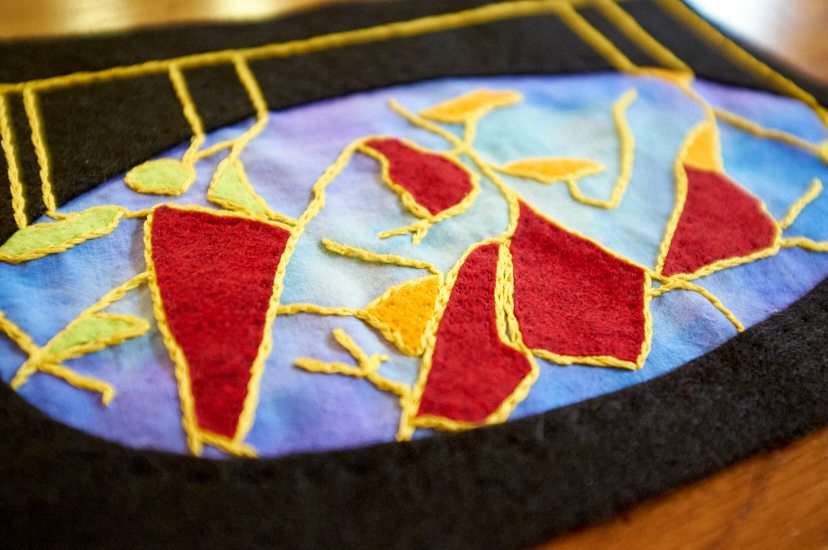
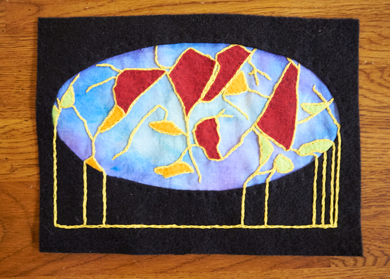
Since this was an abstract piece, I didn’t want a plain frame, so I continued the yellow in straight lines away from the organic meandering of the main design. Originally, I envisioned it all to be vertically orientated, with the yellow lines on the left, but honestly it works in any direction. I think placing those lines at the top, as if the main design is being “hung” from them as shown in the first image, is my favorite.


0 Comments