Since this week’s TextileArtist.org‘s Stitch Club workshop requires supplies I do not have (transfer paint), and I’m still waiting for some leaves I collected to dry for another, I dug out my list of older workshops I’d like to complete. In 2021, Emily Notman led a workshop having us design a wrap for a jar in her mixed media style. I am waiting for the day art historians appreciate fiber art just as much as painting, so we can speak of textile artists in styles such as Impressionism. This is where I’d place her; she uses color and texture to allude to cheery landscapes, and I fell in love instantly! And this bring to my attention the style of textile art I am always most drawn to, the ones that are impressions of beautiful worlds with rich texture and lovely color combinations. This style is also the hardest for me to work in, wah wah.
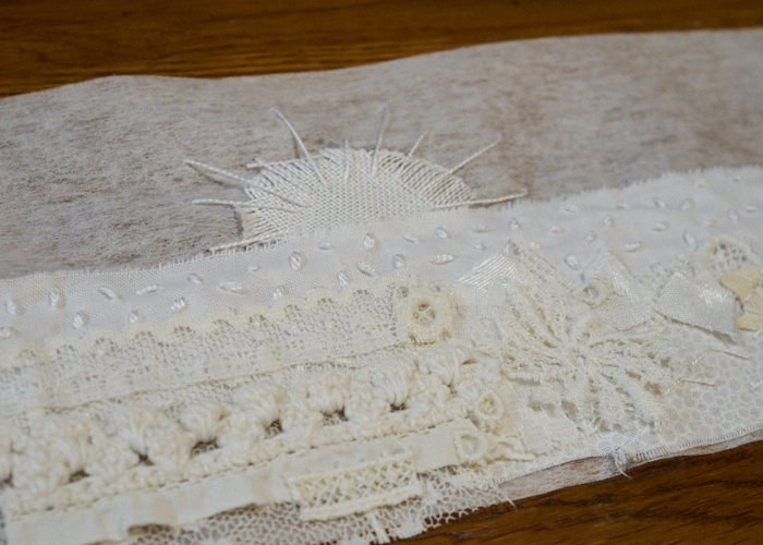
I began with a white palette, mixing little snippets of fabrics and trims. I was not in love with my piece at this stage, but I have learned that doesn’t matter! Sometime along the way, I learned that in most instances, whatever I don’t like about a piece can easily be remedied later if I feel it is worthy of salvaging. Thus, I continued undaunted with paint.
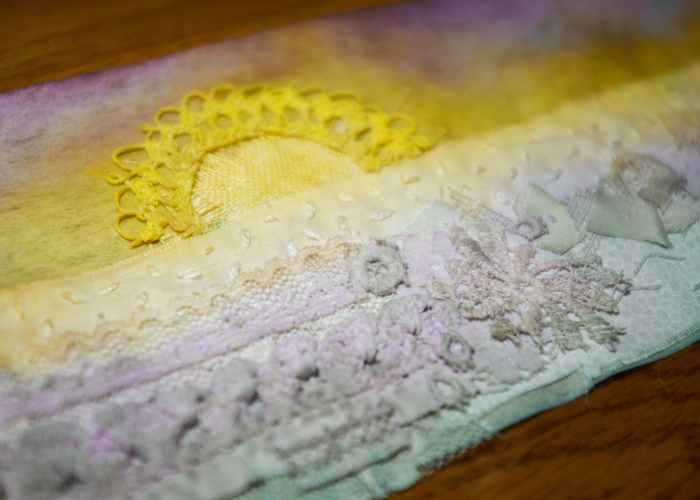
I am new to adding paint to cloth. My first real trial was through my Ruth Norbury project, and it was a struggle. Of course, I used calligraphy ink on that one, while here I used more familiar acrylic paints. I recalled something important Ruth taught me – that paint is afraid of water. That seemed so counter-intuitive to me for some reason. (Wouldn’t the paint want to spread into the water? But, no!) So, when the purple started mixing into the yellow where I didn’t want it, I simply dabbed a bit of water there and got the results I wanted. I had a color vision in mind, and while the real life results don’t match it well, I was happy enough with them to proceed to the next step. And, you can see I became dissatisfied with the sun and added some vintage hand-knotted trim that I painted.
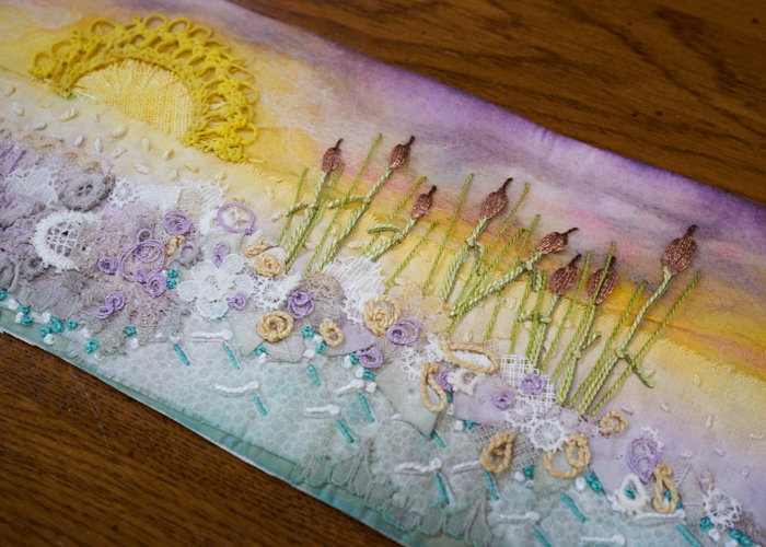
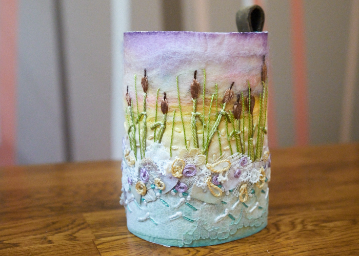
I needle felted a bit of color and texture into the sky. Then, I needed to add something to the other side of the wrap, but I hemmed and hawed because I wasn’t sure what. My original intent was to create a ferris wheel, black against a sunset with maybe some fun colored squares to be buildings along a beach front. I abandoned this idea though; it isn’t the right project for it. Finally, I determined that I was not on a beach near a pier, but instead near a lake shore. One with cattails!
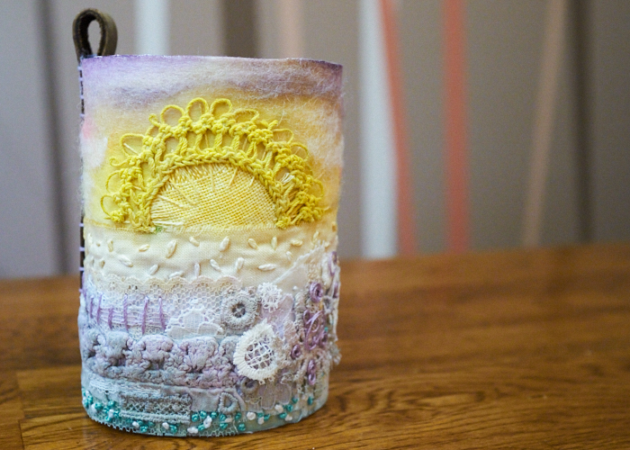
I followed the next steps of the workshop to stiffen it up a little, then decided to add a leather join, with a little loop at the top. It provided a really nice stability to the jar wrap.
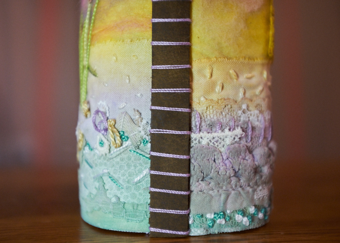
While I had originally picked a small jam jar to wrap around, I embellished almost all the way to the ends of my cut ground so when time came to wrap, I actually left it a little larger than the jar rather than cover anything up. It still fits in there, of course, and still holds things like pencils without them leaning against the cloth. That’s a win!
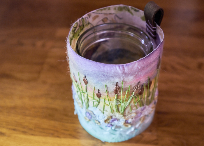
Overall, I really enjoyed Emily’s techniques. It pushed me out of my comfort zone for sure, being more messy and intuition-based than designed, but I like the softness of it and learned a lot. Thanks, Emily! (And can I get a congrats for veering away from my normal colors? Wow!)

0 Comments