
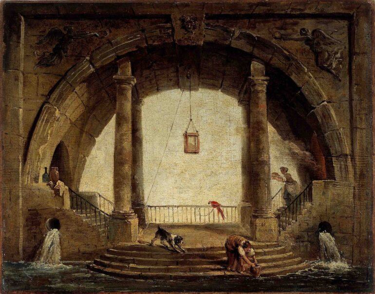
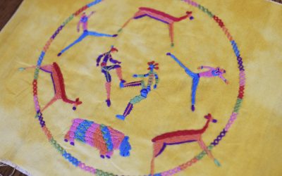
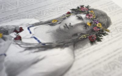
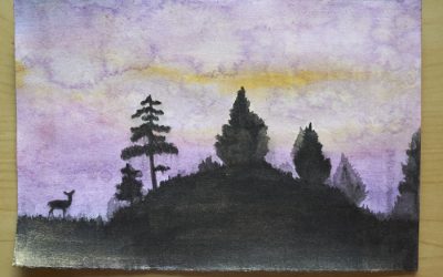
My latest finish for TextileArtist.org‘s Stitch Club was from Ruth Norbury‘s workshop. She asked us to work up a mixed media piece representing an abandoned place (though we could spin this however we wanted and do a lovely garden in bright colors if we so chose). I know I have some cool photos of places I’ve been, such as the Cathar region in France, or I could take screen shots of some beautiful game design (looking at you, Dark Souls lineup), but I chose instead to work from a historic painting.
This is Hubert Robert‘s La Fontaine. The artist has an impressive portfolio, and he almost didn’t survive the French Revolution; quite a life! He was drawn to the ruins of the Roman Empire, and I especially liked the simple lines and stark contrast in this particular painting. It is fun to imagine being here: the sounds, the feel of the atmosphere, the smells, the purpose of such a place – all when it was first built as well as afterward, in its ruined decay.
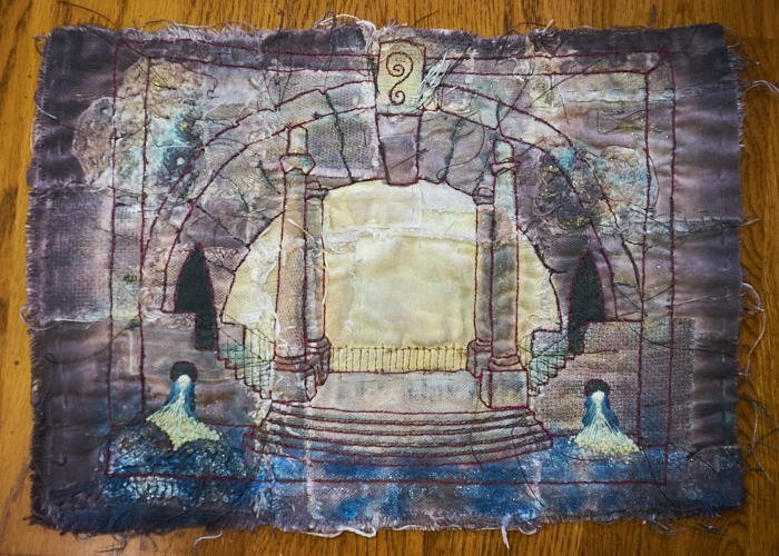
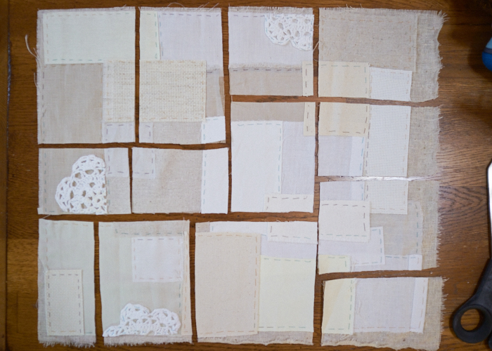
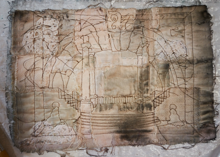
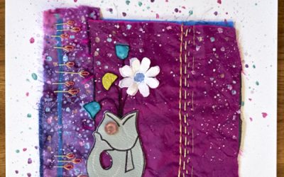
I try not to share too much of the artists’ processes here since that is not my place, but I think it bears understanding that we started with adding a lot of patches to the ground cloth, that we then cut up and washed to make extra texture-y. These were then rearranged onto a new ground cloth. This is lost a little in the dark paint and stitching that I’ve added, but you can see where I started with this; it looks so innocent and naive compared to the end result. So crazy!
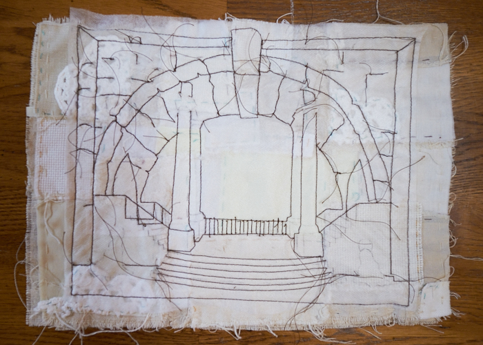
This project was the second time I got to use my new water soluble stabilizer (I can’t show the other project yet). I still need more practice on the machine, but I think I did a much better job than my last machine-stitched project. It felt easier, at any rate, which was surprising considering all the lumps of the ground fabric. I only left a few details to finish off by hand. Then, to the sink it went for the magic reveal!
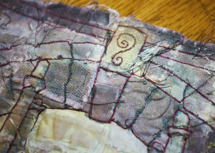
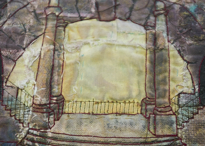
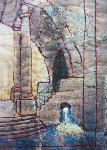
My hand stitching is done with an off-red perle. This would not have been my first color choice, but I work with what I have in my stash and in the particular size I wanted, I had few colors available. It grew on me, though. I did a modified stitch that I call the forward-back stitch in an attempt to put more of the thread on the front (less waste). I just alternated between a back stitch and tight running stitch, if that makes any sense. I only represented the architecture and water here rather than the original artist’s details, so I added my own little detail to the lintel stone.
For the water spouts, I was inspired by a Stitch Club workshop that I haven’t yet participated in, by Bethany Duffy. I don’t yet know her technique, but I added a small felt pad and then a lot of straight stitches in various colors, topped off by some colonial knots in single and double strands. The highlights were too stark, though, even though I didn’t use pure white.
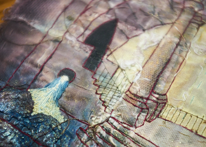
I toned down those and the lighter background area with a dip of tea. I’ll be honest – that went much darker than I would have liked (which is odd, since normally I can’t get tea to dye much at all; though, perhaps the difference here was the tea type since I used a nice rooibos tea rather than my usual Lipton black tea). As for the central area, I like the delicacy of the railings, which I left strictly machine stitched.
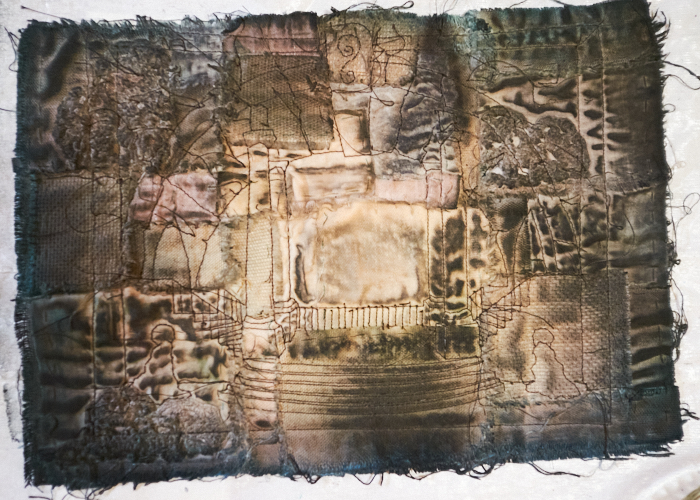
One of the fun surprises with this project is that I had used some old calligraphy ink to paint with, and this was much more enjoyable than previous attempts at painting fabric with watered-down acrylic paints. That said, I had some uber bright shades, such as a lovely and vibrant green color. I thought this would be so gaudy on the piece, but after all is said and done, I really like how the green brings only a hint of algae growth here and there. Before the embroidery stitching was added, I masked off the light area and then used a sponge to add some gold metallic paint around the architecture and silver around the water.
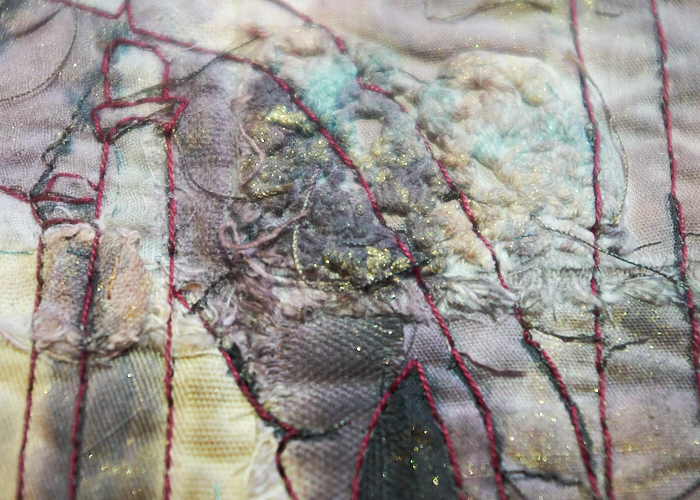
I found that I liked outlining some of the architectural areas from the machine stitching in black alone rather than stitching everything. The thing I most dislike is just where the randomized doily placement ended up, since it made the little waterfall kind of an odd shape on the left. I know I could have worked it on top of the doily, too, if I really cared, but it was getting tough enough pushing the needle through so I opted to work around it instead.
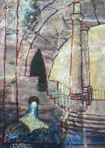
I like the one on the right much better, though I think I might have overdone the lighter water color a little much on both sides. Lessons learned, so it doesn’t bother me. I’m happy with how it turned out overall!
Let’s look at that final version one last time. There’s so much texture here and a lot of subtle nuance that’s hard to see in an image on the screen. Plus, it looks super cool at a distance which I didn’t capture in a photo (it loses a bit of its cool vibe up close, which I find really fun for some reason).
While I am happy with the end result, mostly, I want to show you that I did go through trial and error! At this stage, I couldn’t get passed how it looked like it got ran over by a truck. I hated it, and I wasn’t going to continue with it if I couldn’t make this stage look better first.
Luckily, most of the ink washed out, so I could start afresh. Phew!


0 Comments